+30%
Increase in lead signups
Clearer services structure & stronger CTAs improved user action.

RG
Web Design
Design Strategy • UX Research • IA • User Flows • Wire-framing • Interaction Design • Visual Design • Prototyping • Usability Thinking
House of Calisthenics had strong traction, but the website was not converting. Users struggled to understand the offerings, especially online coaching. The redesign focuses on simplifying navigation, clarifying services, and driving conversions.
Design Strategy, UI, UX, User Research
2024 Q4
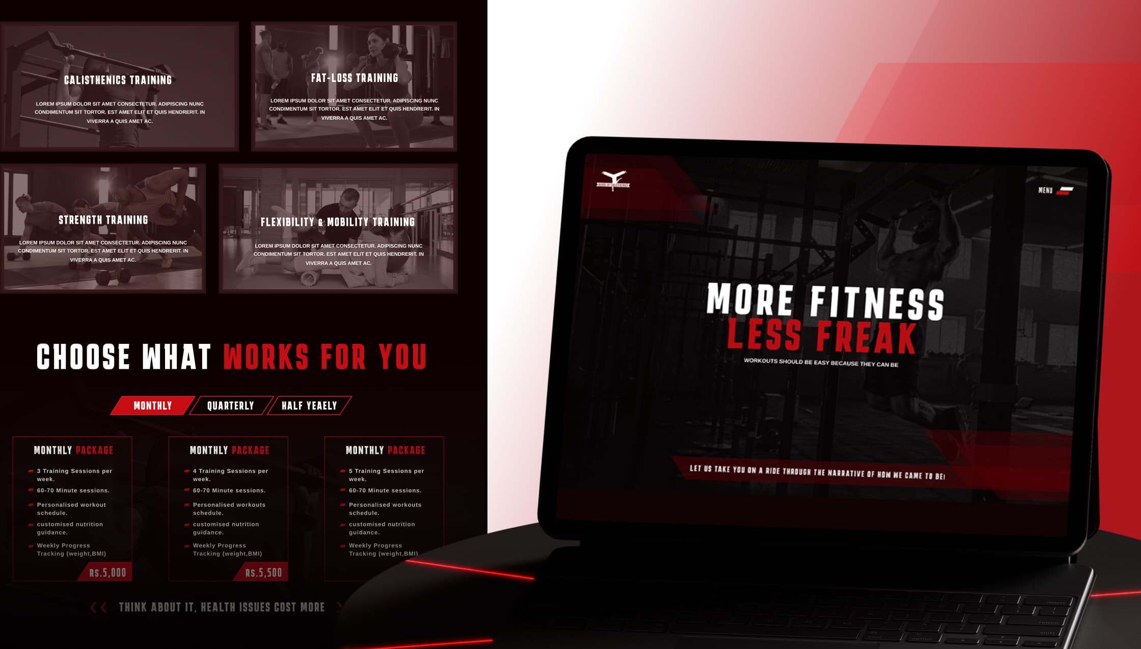
The focus was on reducing drop-offs and guiding users toward signing up for training programs, especially online coaching, by making services easier to understand and quicker to act on.
Users were interested but confused, they could not clearly understand the difference between services or how online coaching worked, leading to low signups. The solution was to simplify the structure, clearly communicate each offering, and introduce stronger CTAs, helping users move from exploration to action with minimal friction.
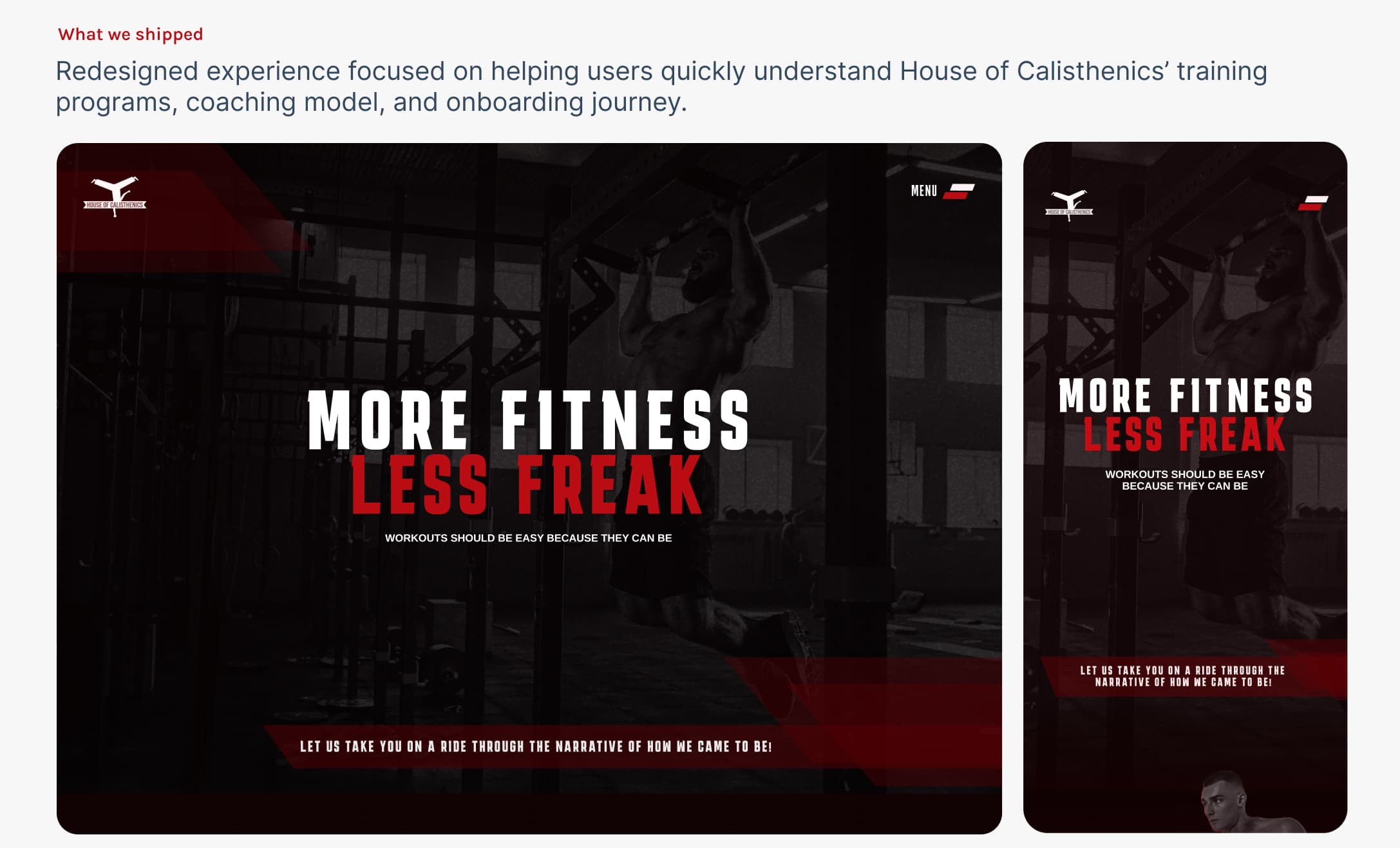
What we shipped
Redesigned experience focused on helping users quickly understand House of Calisthenics' training programs, coaching model, and onboarding journey.
+30%
Clearer services structure & stronger CTAs improved user action.
-15%
Simplified navigation helped users stay and explore more about HOC.
+25%
Better copy flow and clarity kept users engaged longer.
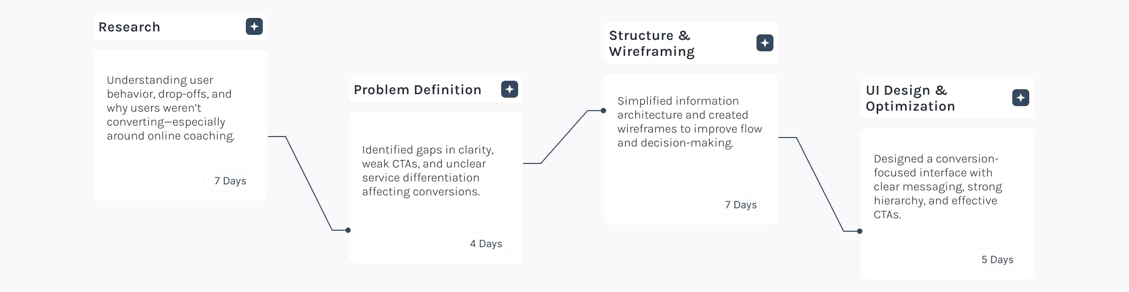
Users were interested in calisthenics training but struggled to understand the platform's offerings. Unclear service differentiation and lack of explanation around online coaching led to confusion, drop-offs, and low conversions.
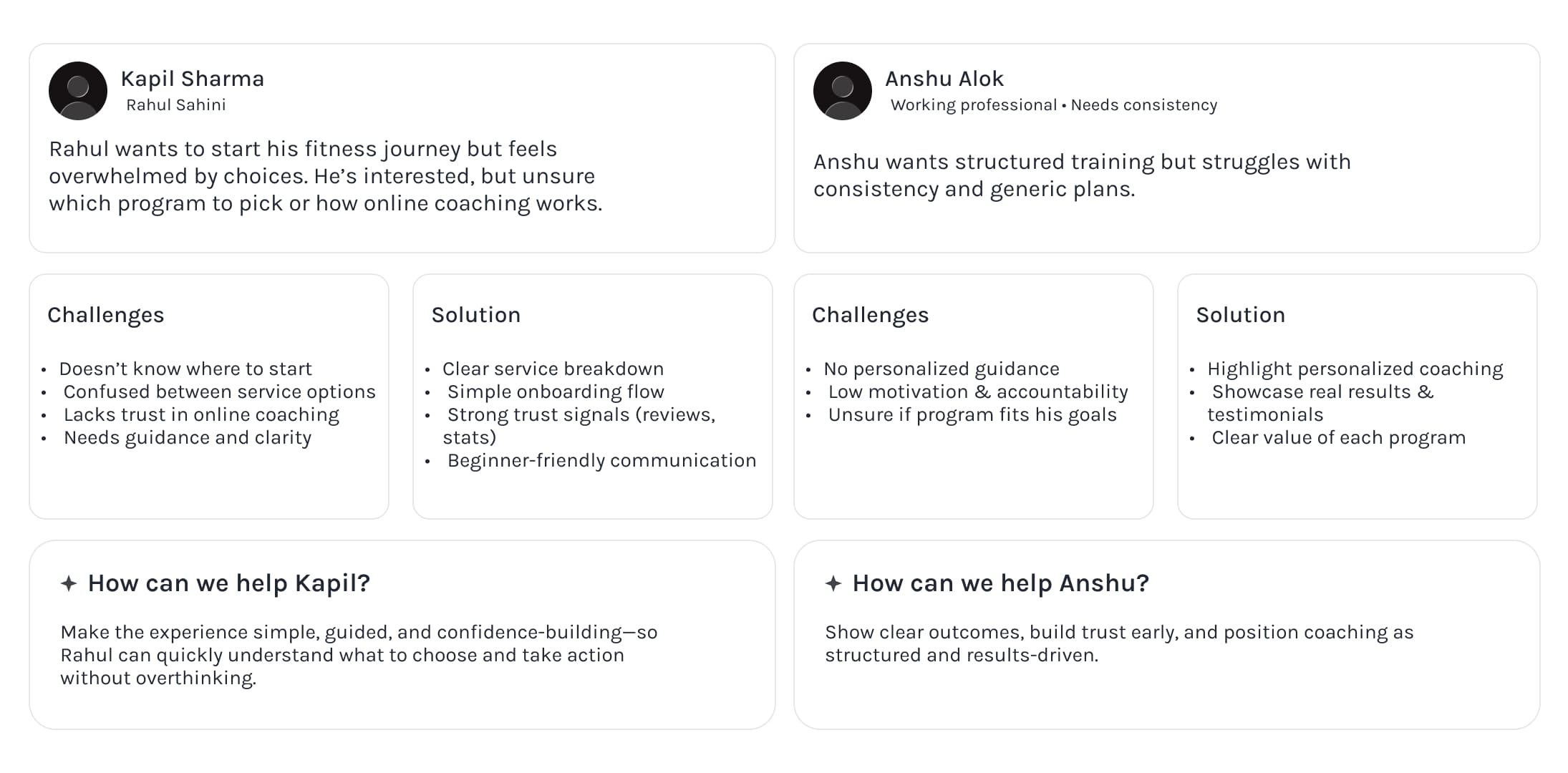
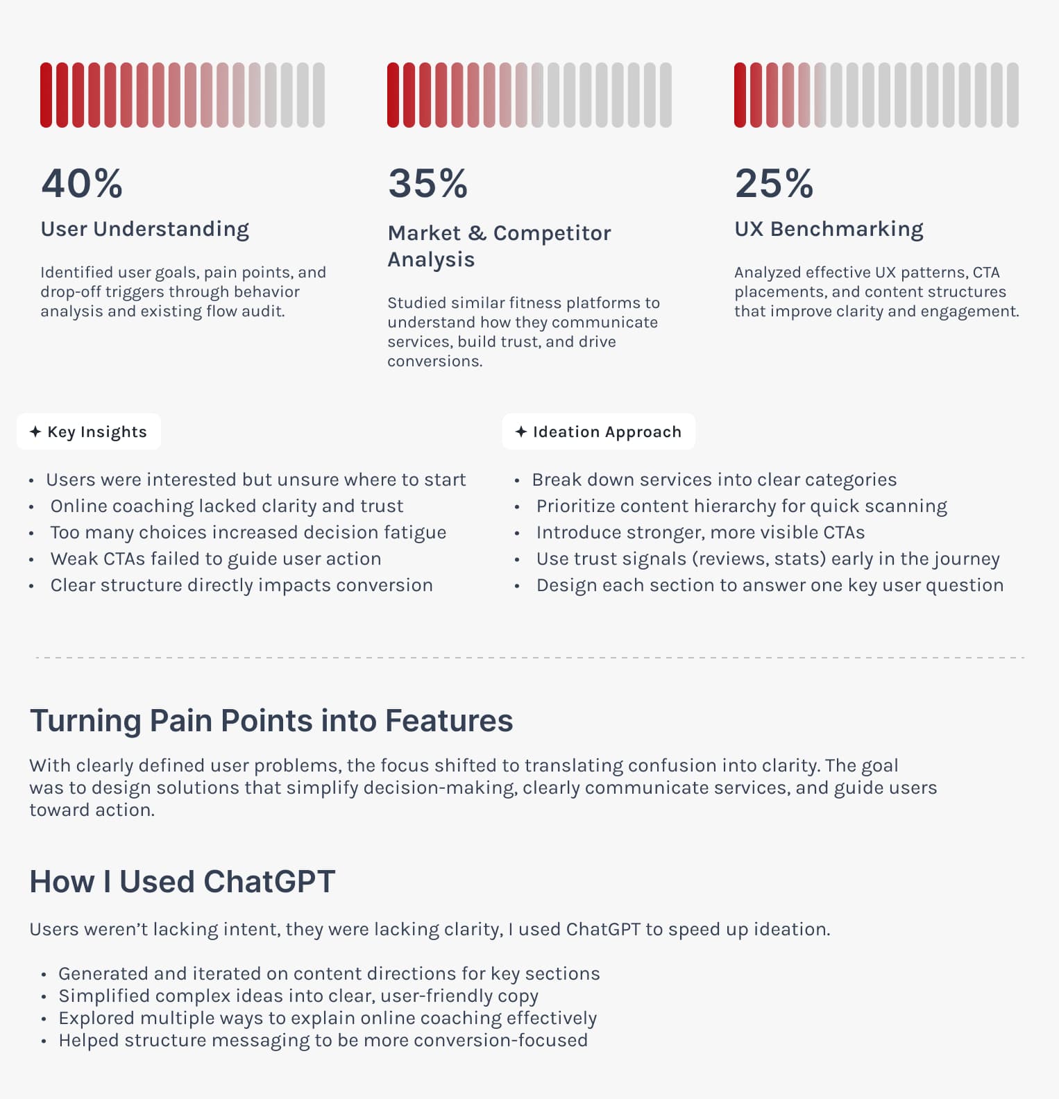
Research & Ideation
Before moving into visual design, I analyzed user behavior, drop-offs, and interaction patterns to identify where users were getting stuck.
The goal was to ensure every screen answers a clear user question, reducing confusion and guiding users toward action.
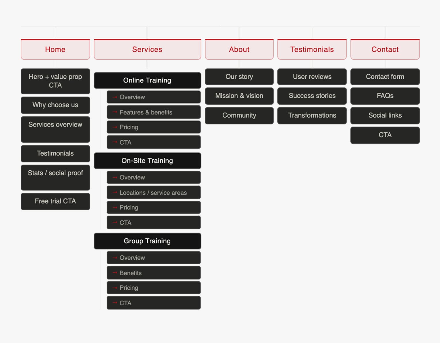
Site Map
Before moving into visual design, the focus was on structuring the experience to reduce confusion and guide users clearly through the journey.
Ensuring each page has a defined purpose, answers a specific user need, clear CTAs and leads to a clear next step.
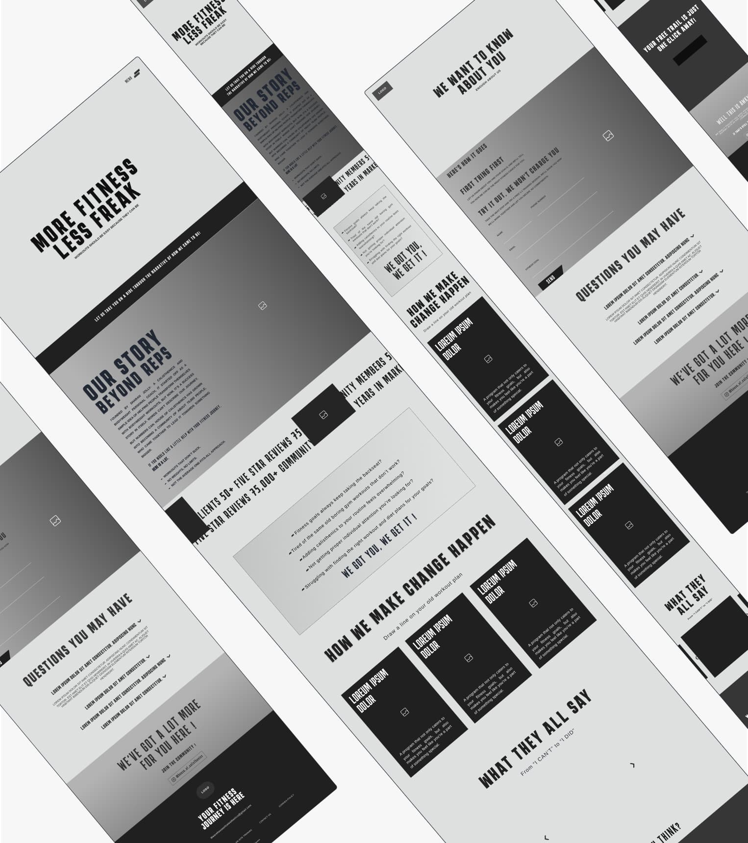
Wireframe
I created low-fidelity wireframes to validate structure, hierarchy, and user flow, while keeping competitors and user flow in mind.
The focus was not on visuals, but on ensuring clarity, each screen was designed to answer a specific user question and guide them toward the next step.
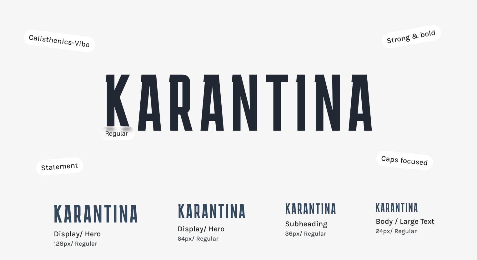
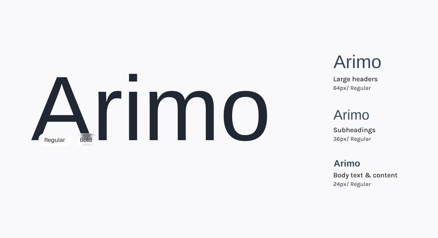
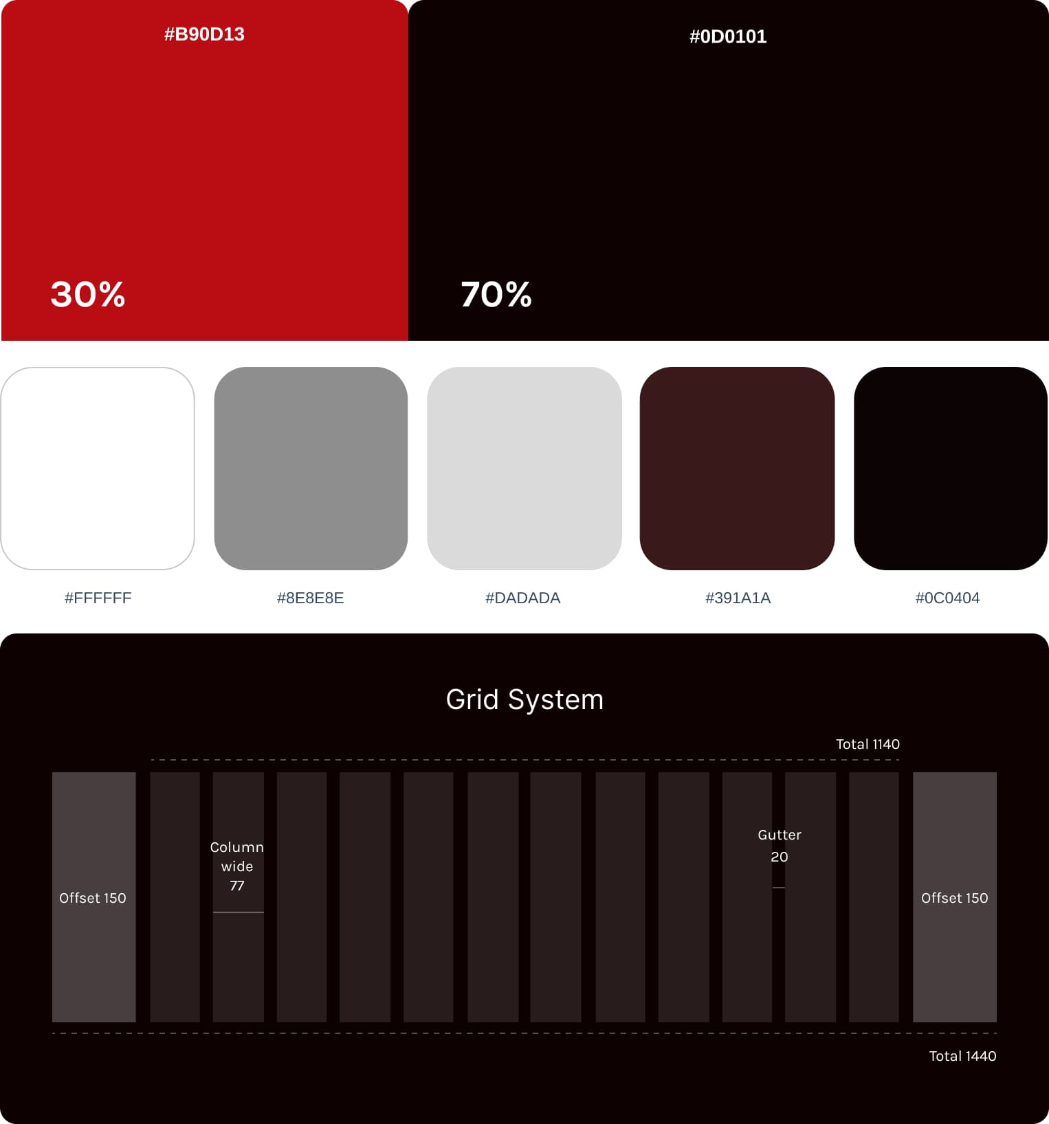
Design system
Typography was chosen to reflect strength, boldness, and energy, aligning with the bold nature of calisthenics training.
The goal was to create a strong visual hierarchy that grabs attention while keeping content short, readable and easy to scan.
Primary Font
Secondary Font
Design System
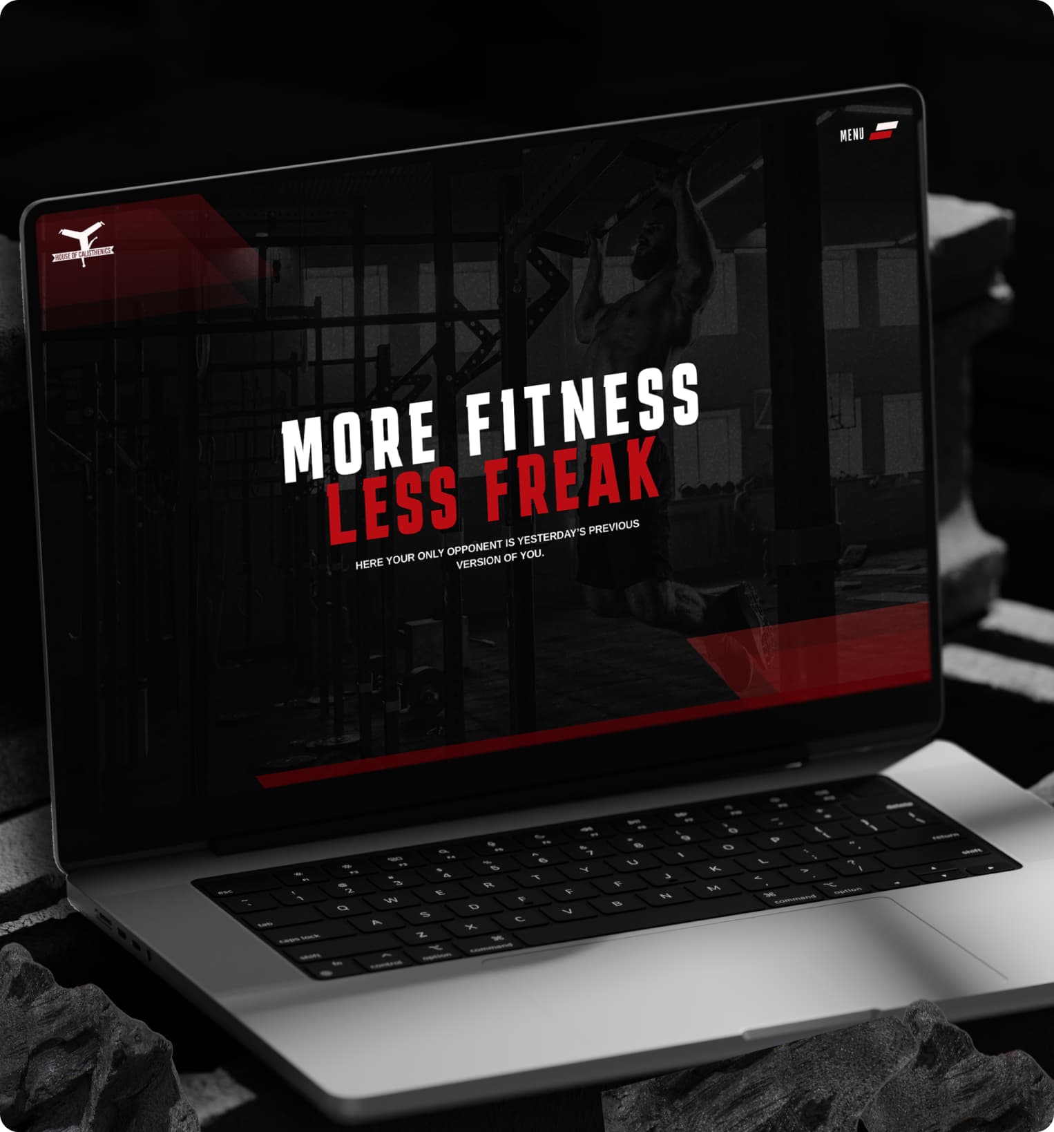
Simplifying services and explaining the coaching model created a clearer path to signups.
Reducing cognitive load helped visitors move through the site with less hesitation.
Sharper structure, proof points, and focused CTAs made the training offer feel more credible.
A strong visual surface only works when the journey underneath is clear.
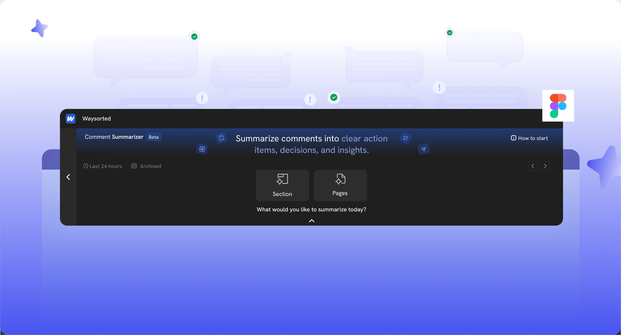
A product workflow case study focused on making design feedback clearer, faster, and easier to act on.
View Case study