Design is More Than Visuals
The project reinforced that good UX is not just about aesthetics - it is about creating direction, confidence, and clarity throughout the experience.

RG
Webpage design
Product Strategy • UX/UI Design • AI Integration • Workflow Design • User Research • Information Architecture • Conversion Optimization
Redesigned the experience to simplify complex AI capabilities into intuitive, role-based journeys, helping users quickly understand what the product does, why it matters, and how it fits into their workflow. The new approach focused on clarity, structured information, and decision-oriented navigation to improve engagement and conversions.
Co-Founder/ Designer/ Strategist
2026 Q1
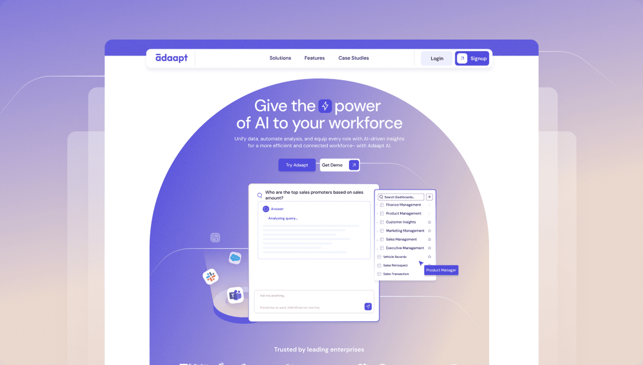
The vision was to shift from a technical, feature-heavy narrative to a clear, outcome-driven experience where users could instantly understand how the product applies to their role and drives real business impact.
Users were interested in the product but struggled to understand its capabilities, relevance to their role, and how to get started, leading to hesitation and drop-offs. The solution focused on restructuring the experience with role-based navigation, simplified messaging, and clear pathways, helping users quickly grasp value, explore relevant use cases, and move toward meaningful action with confidence.
What we shipped
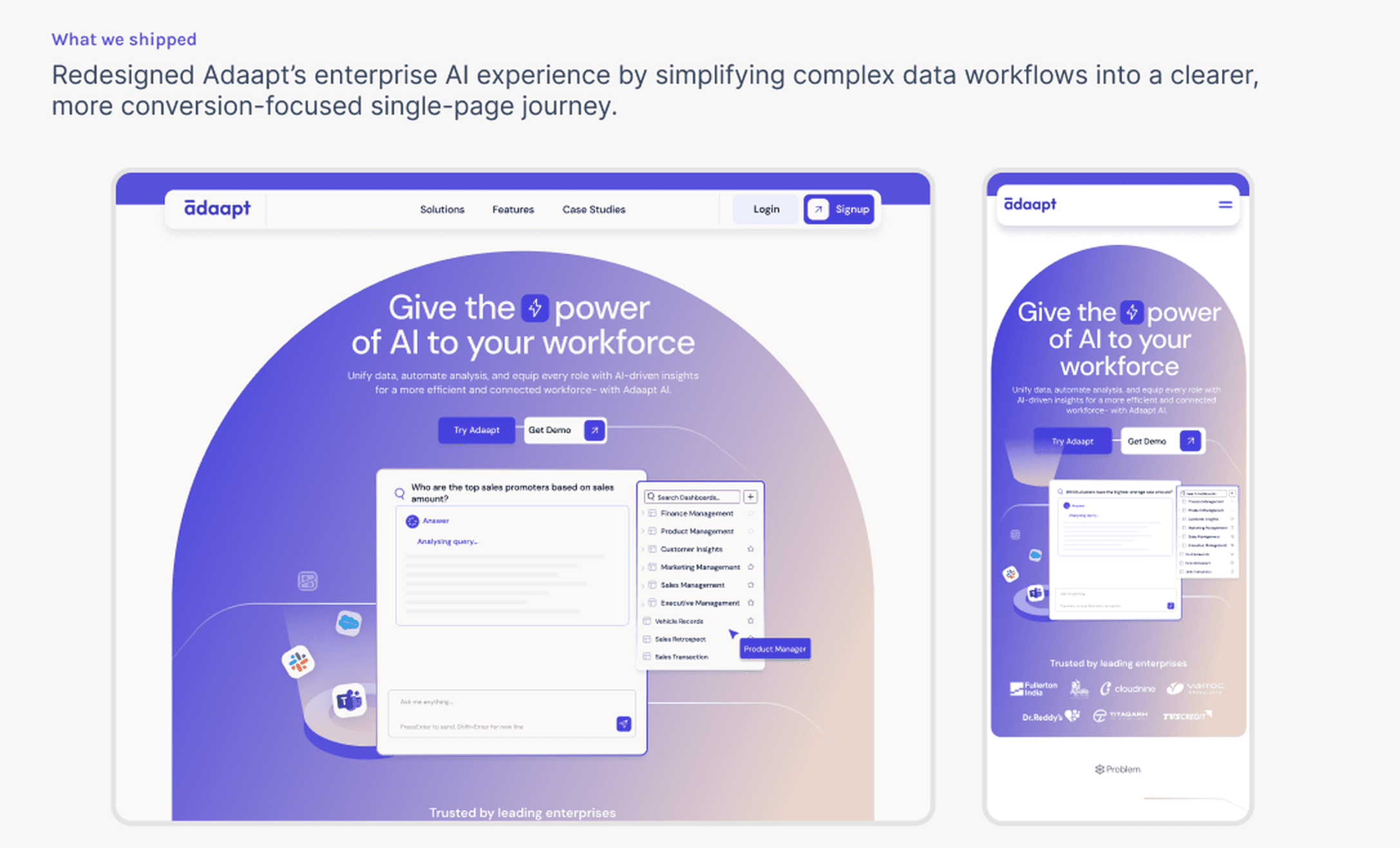
Redesigned Adaapt's enterprise AI experience by simplifying complex data workflows into a clearer, more conversion-focused single-page journey.
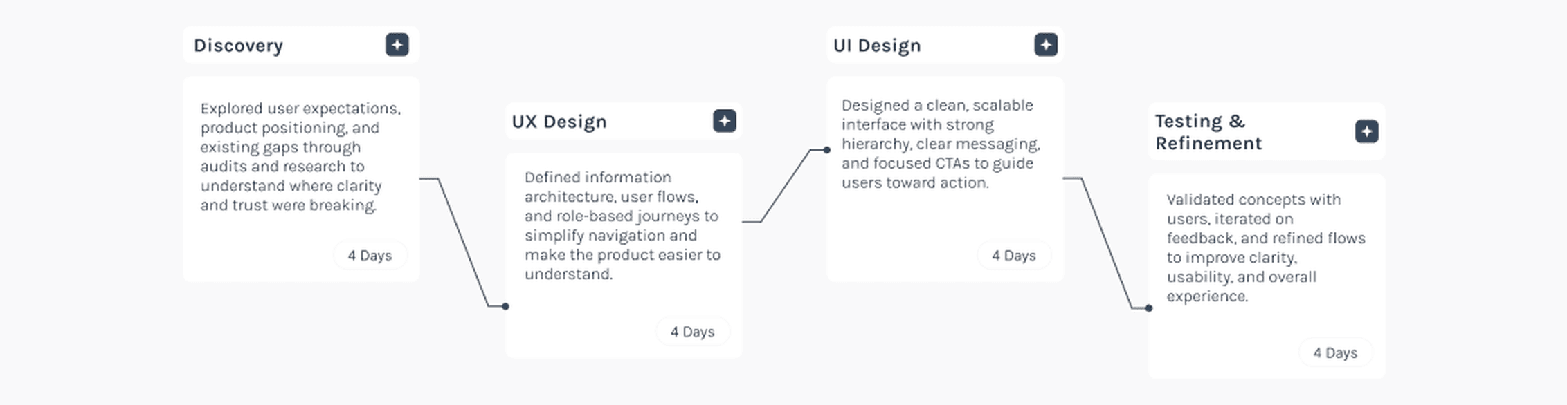
Scope of the work
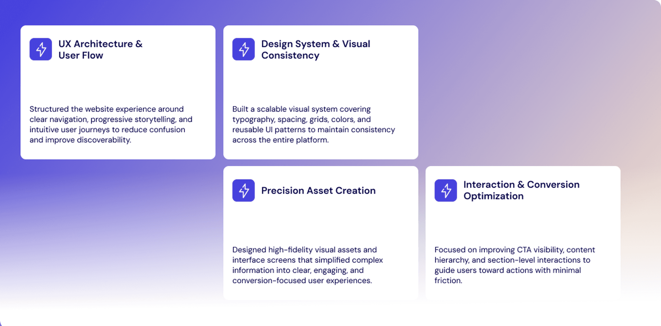
The scope focused on information architecture, user flow, design system consistency, precision asset creation, and conversion-focused interaction patterns.
The goal was to help users understand what Adaapt does, how the platform works, and why AI-powered workforce analytics matters to each role.
Design Approach
Before moving into visual design, I focused on structuring the experience around how users understand Adaapt's core value, turning complex data into simple, actionable insights.
Instead of designing screens in isolation, I mapped out how users would move across key sections like the hero, solutions, features, and case studies.
The goal was to ensure a clear narrative flow from what Adaapt does, to how it works, to why it matters.
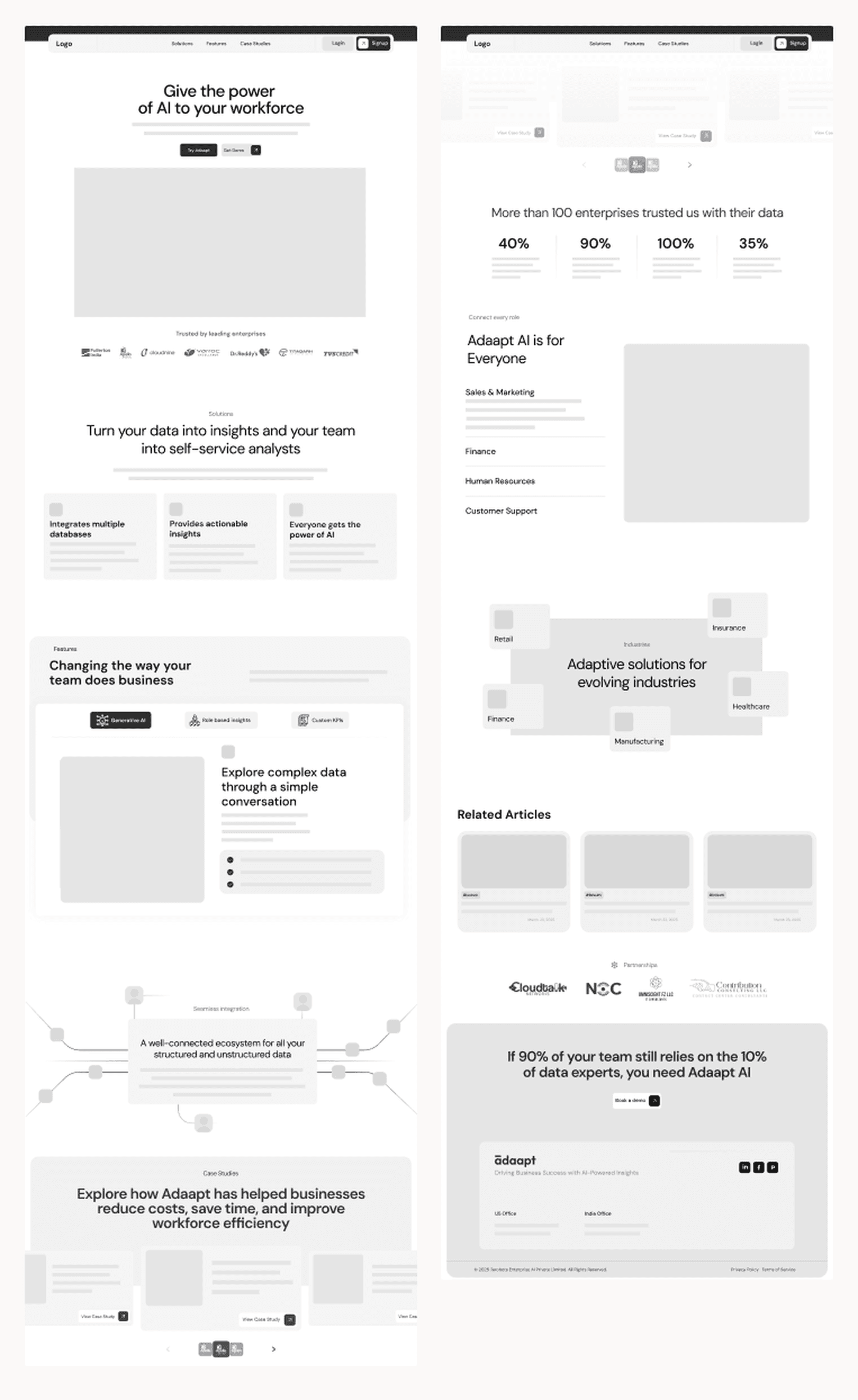
Mid-Fidelity Wireframe
I created low-fidelity wireframes to validate structure, hierarchy, and user flow, while keeping competitors and user flow in mind.
The focus was not on visuals, but on ensuring clarity. Each section was designed to answer a specific user question and guide them toward the next step.
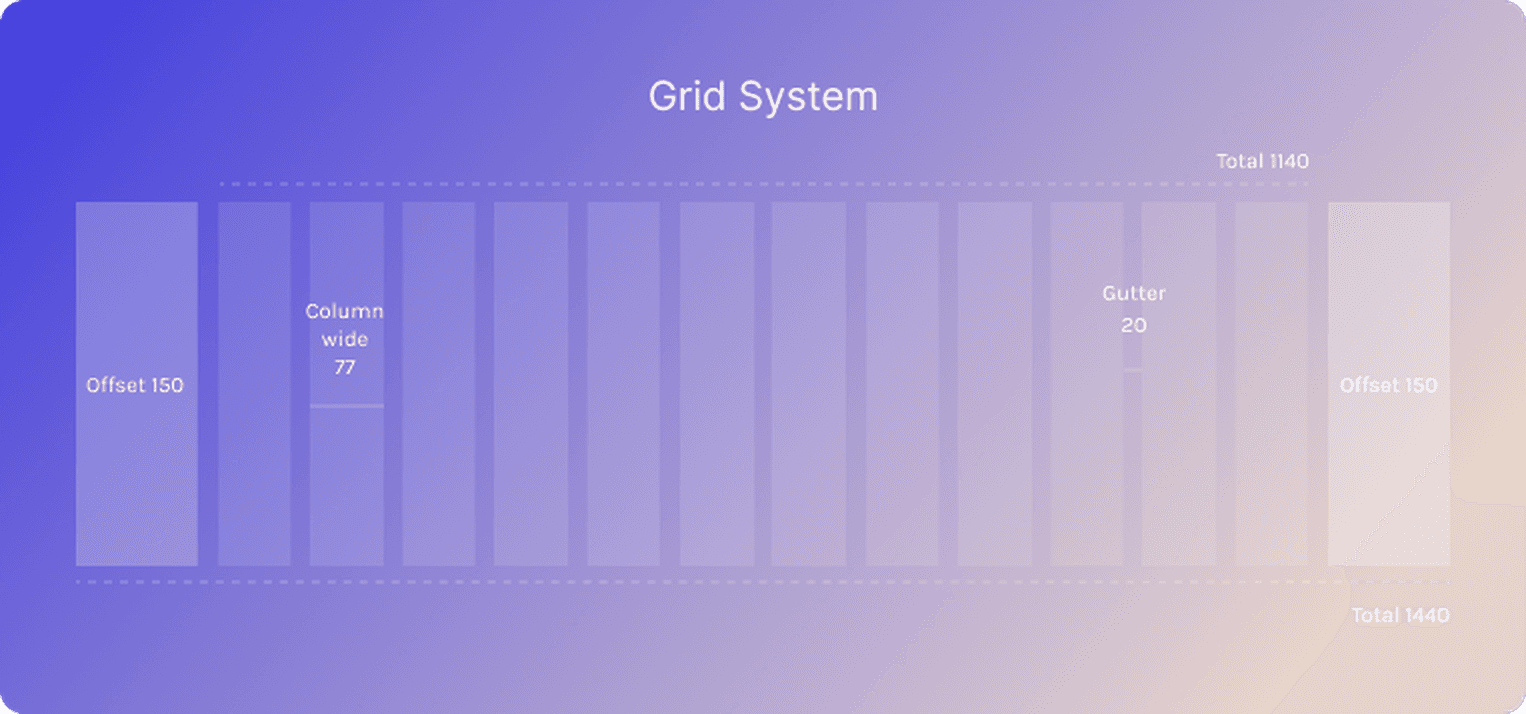
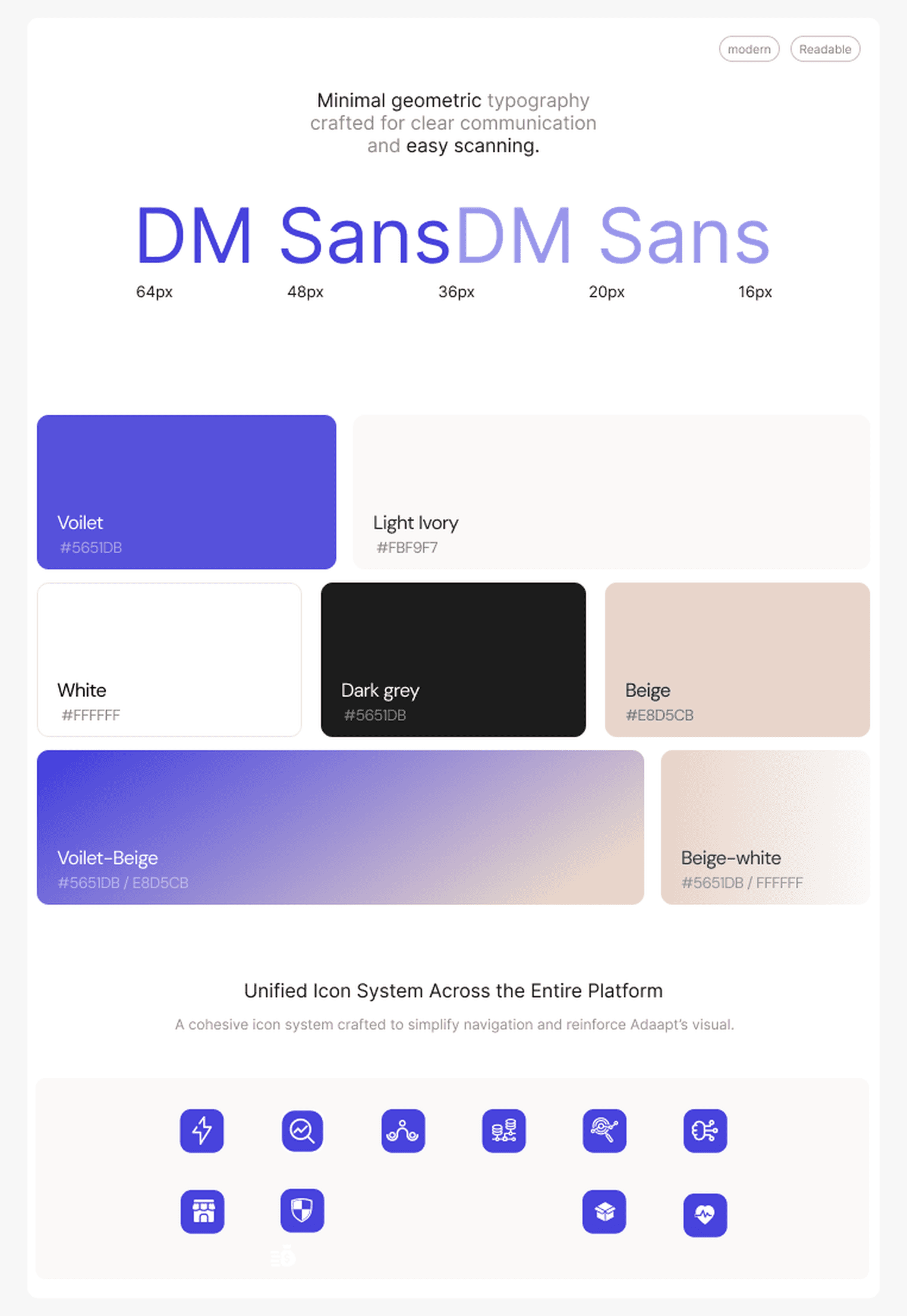
Design system
To ensure the Adaapt experience felt scalable and cohesive, I established a foundational design system covering the grid structure, typography, colors, spacing, and iconography before moving into high-fidelity exploration.
The focus was on creating reusable patterns and a consistent visual language that could support complex enterprise content while still feeling approachable and easy to navigate.
Feature card components
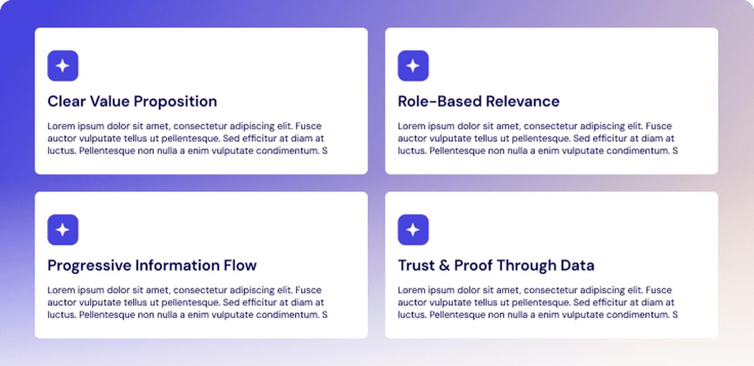
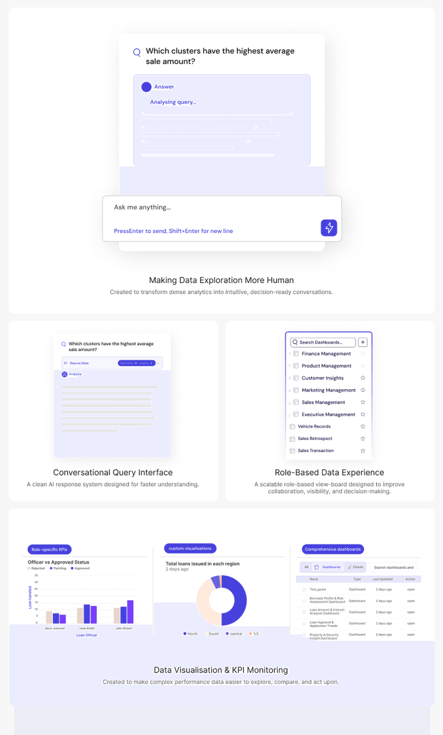
I translated the wireframe structure into reusable feature cards, query states, dashboard previews, and role-based sections.
The final components were designed to make dense analytics feel easier to scan, understand, and act on.
The project reinforced that good UX is not just about aesthetics - it is about creating direction, confidence, and clarity throughout the experience.
Even data-heavy platforms can feel approachable when content hierarchy, storytelling, and interactions are designed thoughtfully.
Reducing unnecessary choices and guiding users through a clearer flow helped improve engagement and decision-making.
Building reusable patterns and consistent UI foundations early made the experience more cohesive and easier to scale across sections.
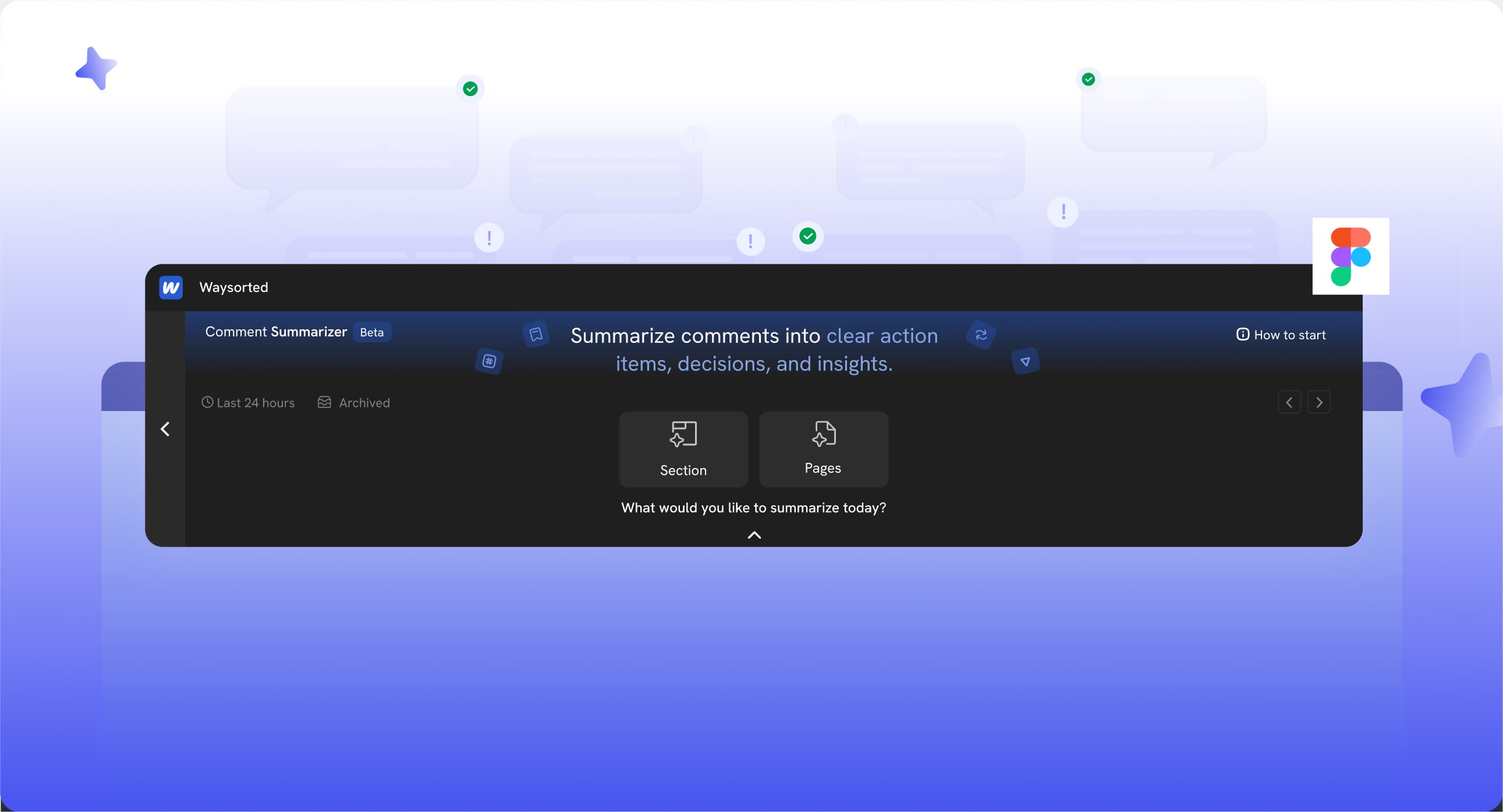
A product workflow case study focused on making design feedback clearer, faster, and easier to act on.
View Case study